10bis
10bis offers online web and mobile food ordering services. I redesigned and improved the consumer apps and website.
As a Product Designer for the consumer side, I have been able to update the legacy of the product to a much needed refreshening. The product has been around for a long time and has an endless amount of special edge cases. Redesigning the native mobile apps and desktop products, while ensuring the proper user research and testing was completed, gave the opportunity to build a user friendlier and enjoyable experience for both B2B and B2C users.
Challenges
As mentioned, the product has been around for 20+ years and has a lot of legacy. The company had recently been acquired by Takeaway.com, which made the apps and website in need of a design change to fit in with their design language. The old website and apps were already outdated so aside from needing to adapt the design system, the product needed to be updated both on design and development sides. The development team had to deal with a big migration in its code, which caused the slow adaptation of the designs for an extended period. Fortunately, together with motivated Product and Developers, we have been able to turn the product into something that's up to date and includes features that competitors are able to hopefully draw inspiration from.
Before > After
Below you'll find some of the differences I have contributed to the Native Android app design. These changes are the same for the iOS app and similar on the desktop/mobile web platform.
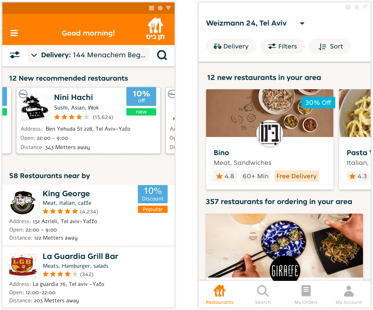
Restaurant list
Part of the restaurant menu redesign was to include food images for the restaurants, which allow the user to visualize and build an expectation/easier way of choosing what restaurant to order from. This in turn would make the decision making easier and order flow shorter.
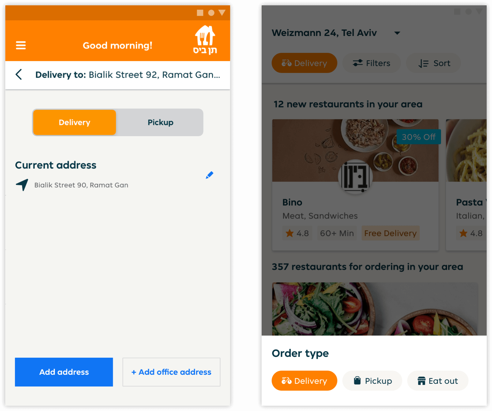
Order type
The redesign of the order type was to easily access and be able to switch between delivery/pickup or eating out at a restaurant. In the before design, you can see that the user needed to go into the address section and from there only be able to switch order type. In the redesign the user can quickly change it through a bottom sheet without needing to leave the view of the restaurant list.
New address
Adding a new address now is easier since the user can choose to use his or her location and drag the map to locate/define the delivery location.

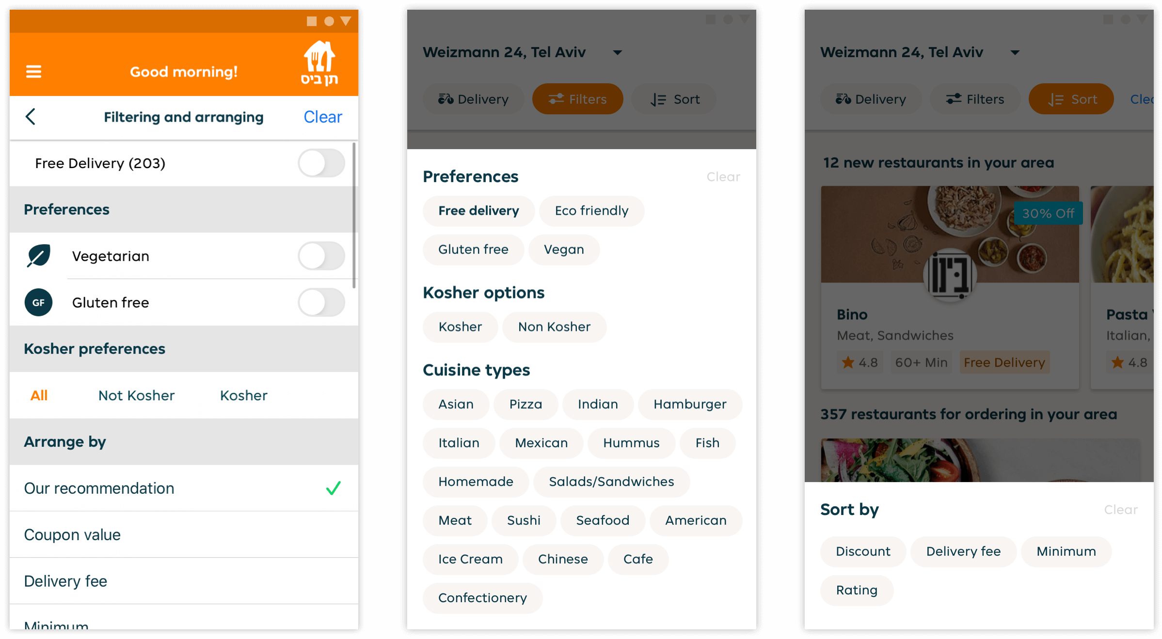
Filters and sorting
A big change for the filters/sorting was long overdue. The filters and sorting options were located on a different page with its behaviour forcing the user to having to go back and forth between the restaurant list and the filters/sorting page. With the redesign, the user can choose what kind of food they crave, define dietary options and sort by their preferred choice all without leaving the list, with more importantly seeing live updates happen on screen.
Restaurant menu
The restaurant menu page needed the user to scroll before seeing most of the dishes. The orange toolbar used up real estate that was unnecessary and distracted from the focus on the dishes.

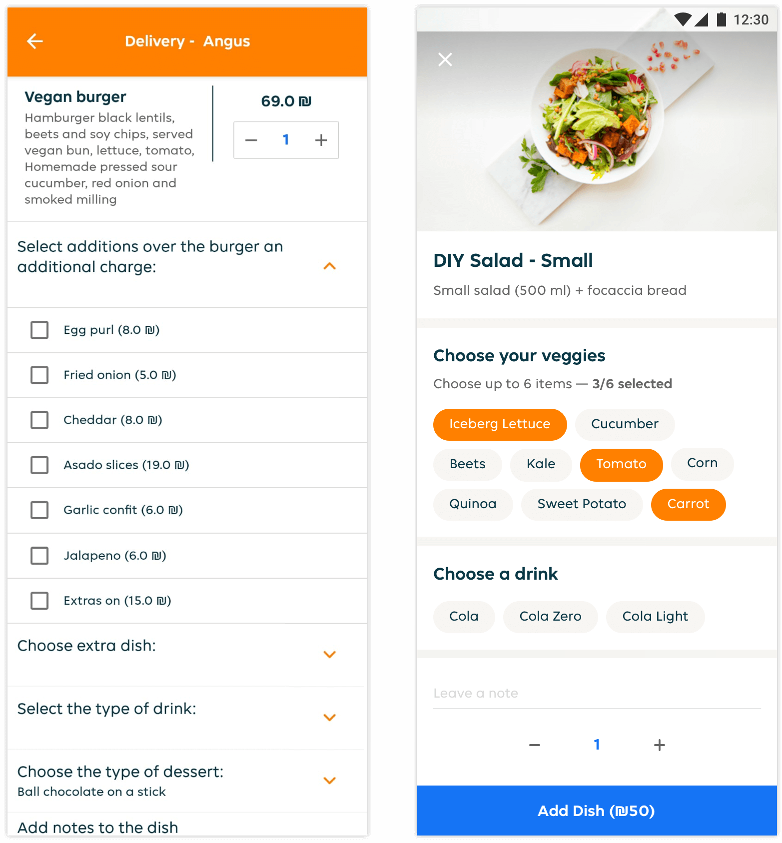
Dish order page
The old dish page inconveniently uses collapsable sections for the add-ons/ingredients of a dish. From multiple user feedback sessions and usability testing (and common sense), this was an issue that frustrated a lot of our users. Opening up the sections and changing the options from radio buttons/checkboxes listed vertically to clouds of native chips made customising and ordering a dish much quicker and more efficient.
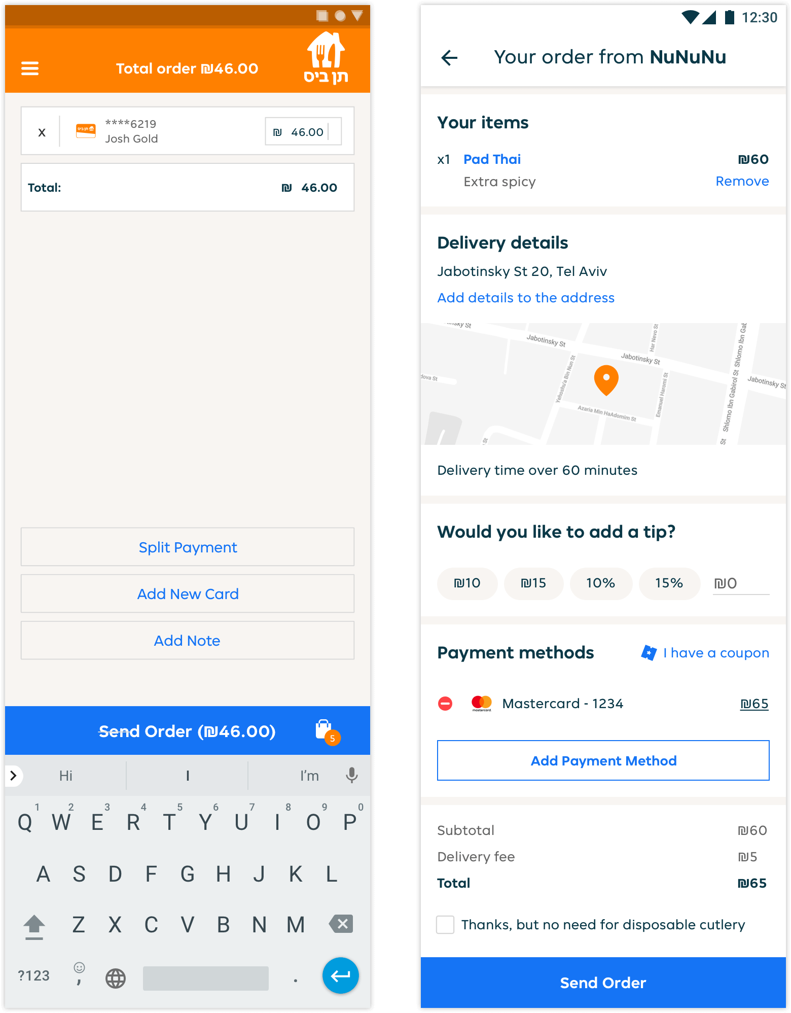
Checkout
The old flow was divided into two stages, the basket and the checkout/payment screen. In order to increase conversion and UX we combined the basket and payment screen, which has shown a substantial growth in conversion. The new checkout includes a map for extra validation and helps users confirm using the right address.